The Machine Learning Architecture
This chapter will concentrate on the Data Analysis portion of Machine Learning. This process starts with acquiring data and cleaning it. Data can come from various sources like websites, live streams of video, financial data and many more forms. This is often a raw representation of data and needs to be cleaned before it can be used for analysis. The cleaning phase also implements feature engineering that helps in building prediction models accurate. Exploratory Analysis of Data is a step that helps in understanding the presented data and perform basic statistical analysis like recognizing the spread, variance, and deviations in the data. Most of this process is recurring and occurs repeatedly, often more than once. It is also considered a good practice to run more than one algorithm on a data set to get to the best possible solution. The diagram below shows the architecture of a data analysis project.
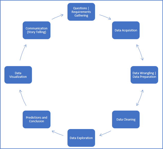
The image shows the common cycle of events that occur in a project that involves analysis of data and implementation of Machine Learning algorithms.
About the Data
When a home buyer goes on a search for their dream house, there are plenty of factors they connect before selecting a house. In this data set we will be trying to figure out what the most important factors are before a person decides to finalize their purchase of a home. We will see how factors like height of basement, length of ceiling, or the distance to a supermarket are probably less important than the size of the house, per-square feet rates and the quality of neighborhood. Similarly, number of bedrooms, size of bathrooms is compositely more important than the number of cars that can be parked in the driveway. With 79 illustrative variables throughout the data, that describe this data set, we will work across variables that influence the prices of houses in Ames, Iowa.
Acknowledgments: The
Ames Housing dataset is a compilation done by Dean De Cock and is open sourced for data science education. It is often confused with the Boston House Prices data set and be an extension to the same with addition of a few more detailed features.
Exploration of Data (EDA and Visualization)
In terms of statistics, Exploratory Analysis of data is an approach that allows analyzing data sets to summarize the main characteristics of that data. This process includes use of statistical graphs, models, and various methods of visualization. The aim of this procedure is to initiate the process of data analysis by understanding the lengths of information, the extremes (minimum and maximum), the averages and outliers of data. EDA is the step we execute before diving into the analysis. It is meant to give an overall understanding of the data presented. With a combination of visualizations and statistical modelling (univariate, bi-variate, and multivariate) tools that give insights into the different relationships within the data set. Below are a few concepts we will use to understand the data better.
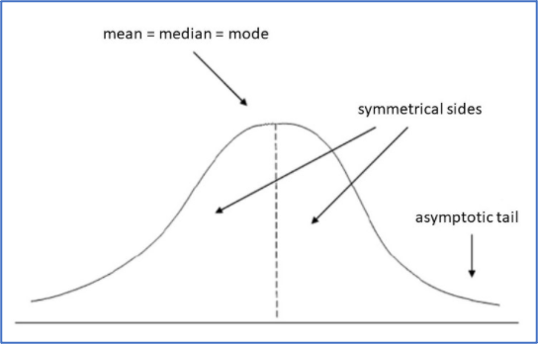
- Normal Distribution: The normal distribution, seldom called the gaussian curve, is a probability distribution function that represents a symmetric distribution of data on both sides of the arithmetic mean. The right portion of the data is the mirror image of the left portion. Almost every natural phenomenon we observe today in the world follows the normal distribution. An important takeaway from the Normal Distribution curve is the 3 Sigma rule that states, 99.73% of observations under a normal curve fall within 3 Standard Deviations from the Mean.
- Shapiro Test: The Shapiro-Wilk test is a normality test in statistics. This test tests the null hypothesis that a given sample of data has come from a normally distributed sample population. The interpretation of the tests is, that, an alpha of 0.05 having a p-value less than 0.05 rejects the initial null hypothesis.
- Kurtosis: Kurtosis, like the Shapiro test is used to determine the measure of normality in data. Although, the functionality is different. Kurtosis essentially is a measure of “tailedness” of a data set. The interpretation of the Kurtosis value may vary as the values change.
So, let's begin the EDA by summarizing all the information we have in this dataset.
# Importing all the necessary libraries for performing the House Price Prediction
import numpy as np
import pandas as pd
import seaborn as sns
import scipy.stats as stats
from scipy.stats import norm
import statsmodels.api as sm
import matplotlib.pyplot as plt

# Import the training and testing datasets
housing_train_data = pd.read_csv('HousingTrain.csv')
housing_test_data = pd.read_csv('HousingTest.csv')
housing_train_data.head()


>>>
	Id	MSSubClass	LotFrontage        MSZoning		LotArea	 LotShape Street	Alley	LandContour	Utilities	...	… PoolQC	Fence	MiscFeature	MiscVal	MoSold	YrSold	SaleType	SaleCondition	SalePrice
0	1	060	RL	65.0	8450	Pave	NaN	Reg	Lvl	AllPub	...	0	NaN	NaN	NaN	0	2	2008	WD	Normal	208500
1	2	020	RL	81.0	9500	Pave	NaN	IR1	Lvl	AllPub	...	0	NaN	NaN	NaN	0	5	2007	WD	Normal	181500
2	3	060	RL	64.0	11351	Pave	NaN	IR2	Lvl….	AllPub	...	0	NaN	NaN	NaN	0	9	2008	WD	Normal	222500
3	4	070	RL	61.0	9520	Pave	NaN	Reg	Lvl	… AllPub	...	0	NaN	NaN	NaN	0	2	2006	WD	Abnorml	   141000
4	5	060	RL	84.0	14260	Pave	NaN	IR1	Lvl	… AllPub 	...	0	NaN	NaN	NaN	0	12	2008	WD	Normal	250000

5 rows × 81 columns


# We observe that the training dataset contains 81 columns. The head() method shows only 5 rows. To see the total shape of the training set we use the shape attribute as follows
housing_train_data.shape


>>> (1460,81)


# The training set contains 1460 rows and 81 columns.
# Next step, we check the influencers on the Target Variable - Sale Price
# Getting the main parameters for the Normal Distribution and the distribution that the target variable follows
(x,y) = norm.fit(housing_train_data['SalePrice'])
plt.figure(figsize = (10,5))
sns.distplot(housing_train_data['SalePrice'], kde = True, hist=True, fit = norm)
plt.title('Distribution comparison of the Target Variable to the Normal Curve', fontsize = 10)
plt.xlabel("Sale Price of the House in dollars", fontsize = 10)
plt.show()
>>>
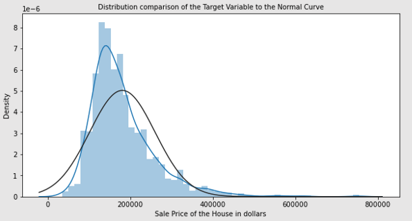
# Theoretically, values beyond 0.5 and -0.5 are considered skewed and Kurtosis is considered for values beyond -2 and 2. The plot above clearly shows that the curve is not gaussian distribution. Rather, data here has a right skew. Let us look through Kurtosis and Shapiro tests to check on this hypothesis.
# Testing for Skewness and Kurtosis on the input data
a,b = stats.shapiro(housing_train_data['SalePrice'])
print("Skewness Value: %f" % abs(housing_train_data['SalePrice']).skew())
print("Value of Kurtosis: %f" % abs(housing_train_data['SalePrice']).kurt())
print("Shapiro Test on A: %f" % a)
print("Shapiro Test on B: %f" % b)


>>> Skewness Value: 1.882876
>>> Value of Kurtosis: 6.536282
>>> Shapiro Test on A: 0.869672
>>> Shapiro Test on B: 0.000000


# Values of Skewness and Kurtosis reveals that the data is right skewed, also Shapiro test confirms that it is not a Normal Distribution
# Investigating individual columns to understand their relationship with the Target Variable. Let's see which are the feature that correlate most with our target variable.
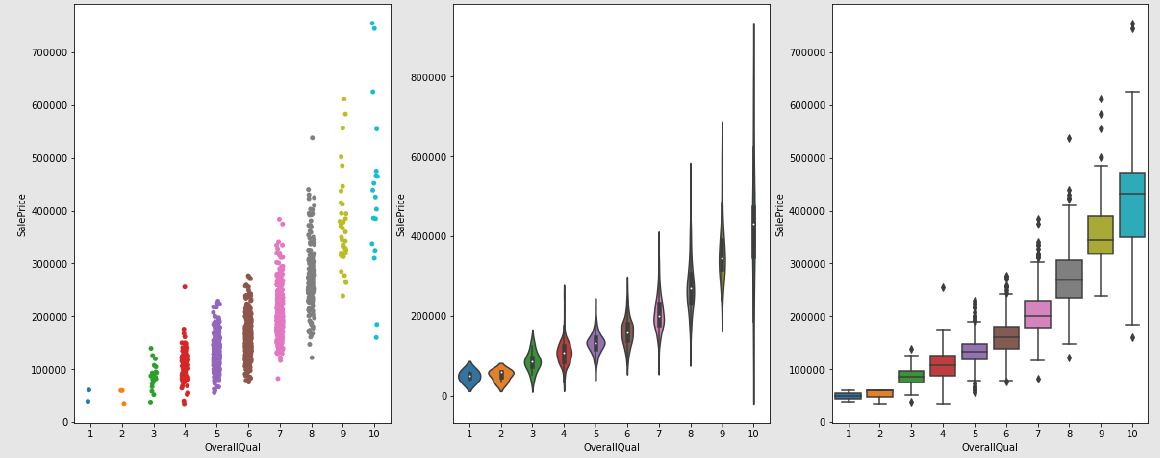
# We start with Overall Quality column that rates the Package's Quality
figs, ar = plt.subplots(1,3, figsize = (20,8))
sns.stripplot(data=housing_train_data, x = 'OverallQual', y='SalePrice', ax = ar[0])
sns.violinplot(data=housing_train_data, x = 'OverallQual', y='SalePrice', ax = ar[1])
sns.boxplot(data=housing_train_data, x = 'OverallQual', y='SalePrice', ax = ar[2])
plt.show()
>>>
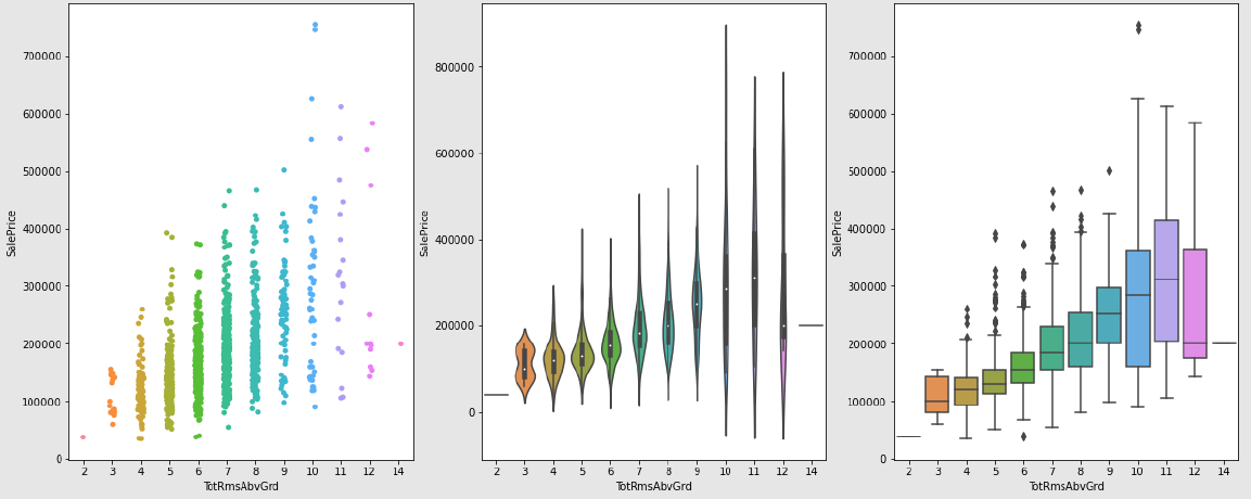
# Understanding the impact of Total rooms above grade
figs, ar = plt.subplots(1,3, figsize = (20,8))
sns.stripplot(data=housing_train_data, x = 'TotRmsAbvGrd', y='SalePrice', ax = ar[0])
sns.violinplot(data=housing_train_data, x = 'TotRmsAbvGrd', y='SalePrice', ax = ar[1])
sns.boxplot(data=housing_train_data, x = 'TotRmsAbvGrd', y='SalePrice', ax = ar[2])
plt.show()
>>>
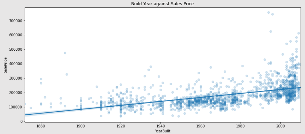
# Impact of the property's build year on its price
Year_Built_Constant = 0.56
plt.figure(figsize = (14,6))
sns.regplot(data=housing_train_data, x = 'YearBuilt', y='SalePrice', scatter_kws={'alpha':0.2})
plt.title('Build Year against Sales Price', fontsize = 12)
plt.show()
>>>
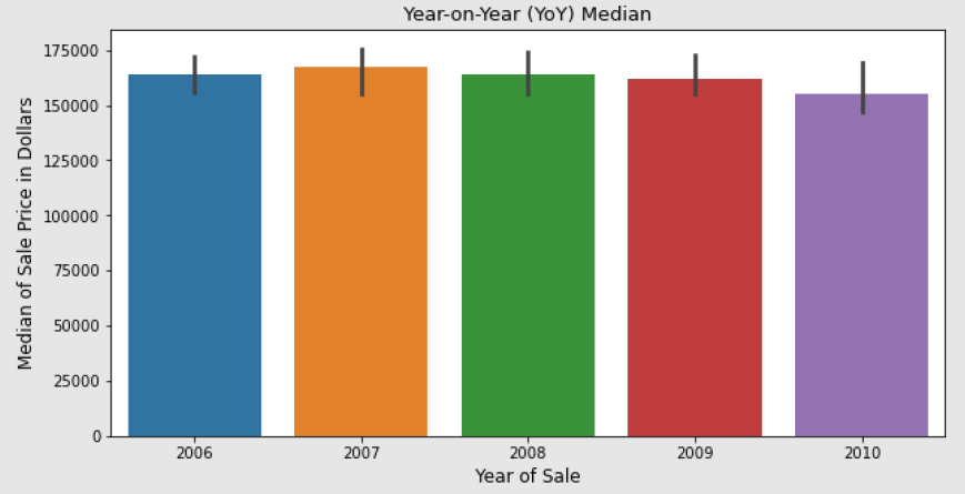
# Understanding year-on-year (YoY) Sales Price's Median
plt.figure(figsize = (10,5))
sns.barplot(x='YrSold', y="SalePrice", data = housing_train_data, estimator = np.median)
plt.title('Year-on-Year (YoY) Median', fontsize = 13)
plt.xlabel('Year of Sale', fontsize = 12)
plt.ylabel('Median of Sale Price in Dollars', fontsize = 12)
plt.show()
>>>
Key observations for the Exploratory Analysis of Data:
- The input contains 81 columns or features that define the price at which a house will be sold.
- Testing for Normality showed that the target variable does not follow the Gaussian Distribution. The Shapiro test also confirmed that distribution is not Normal.
- The test of Skew and Kurtosis confirmed the above hypothesis and revealed that the data is rightly skewed.
- We built a rough Hypothesis that the “Overall Quality” parameter has an impact on the Sale Price of a house.
- We see that the Median Sale Price through 5 years has been around $150000.
We applied EDA to out dataset. In CASE STUDY I – ARTIFICIAL INTELLIGENCE: MACHINE LEARNING, PART 2 we will implement pre-processing and feature engineering techniques and then we'll apply the classification task.
This chapter continues in the following part two.