Introduction
Node-RED is a low-code tool that allows you to develop software applications through the use of different plugins. Node-RED allows you to create the back-end of the application and the development of the respective front-end, i.e. the graphic interface through which the user can visually interact with the system.
In this tutorial you will see how to create your first Node-RED Dashboard using some widgets provided by the relevant plugin.
First, access the Node-RED home. If you don't know how to do it or you haven't installed Node-RED on your server yet, following our guide is recommended on How to install Node-RED on Ubuntu 20.04.
Installing the Dashboard Plugin
In Node-RED there are many Plugins that can be integrated into your project. Some are official, i.e. those directly released by the Node-RED developers, while others are community-produced.
There are also numerous Plugins for the creation of the Dashboard, but in this tutorial it is recommended to use the official "node-red-dashboard" plugin.
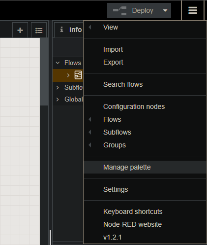
To proceed with the installation, after starting the service and going to the editor home page, select the “Manage Palette” item from the Menu at the top right.
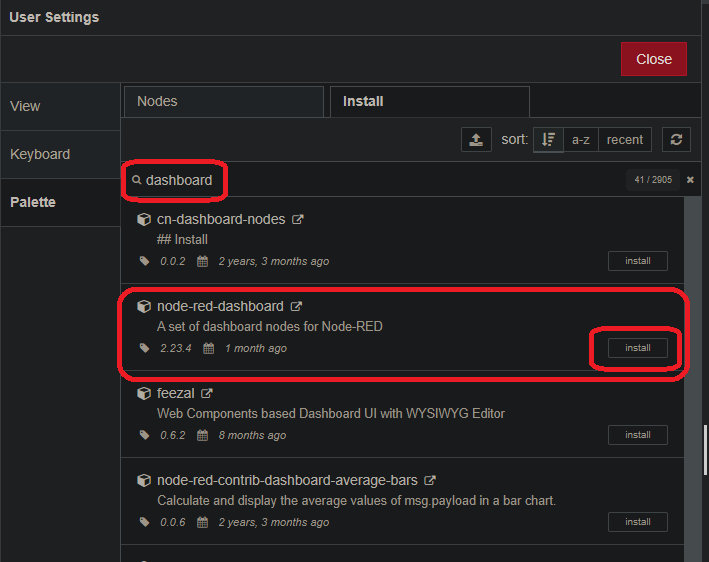
After opening the menu, click on the "Install" item in the "Palette" section and search for the "node-red-dashboard" plugin.
After that, proceed with the installation. At the end of the installation, new elements (nodes) will be added to the elements palette (on the left) to be integrated into the project.
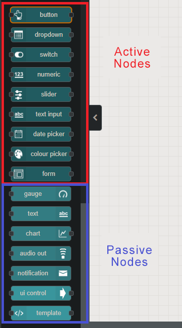
Unlike those already inserted by default in Node-RED, these will have a unique correspondence within the Dashboard you can then create different "screens" (Tab) where to insert the various graphic elements.
The added nodes can be of 2 types: Active and Passive. Active nodes are those that you can directly interact with, while Passive nodes show the received information on the screen.
Added Button widget
Then, try to add a button to the Dashboard: drag the "button" element into the project.
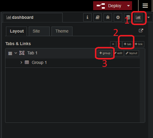
As soon as it is added, an orange triangle at the top of the node that indicates an incorrect configuration of the node itself will be shown. In this case, the error is due to the fact that the first Tab to show and the related Group in which the button should be placed weren’t already defined.
Then, below the Deploy button, click on the Dashboard symbol and add a Tab and a related Group.
After confirming these actions, click twice on the "button" node just entered and fill in the following fields:
- Group: Group which the button is associated to (and relative Tab);
- Size: Size of the widget inside the dashboard (it is advisable not to change this parameter at this point);
- Icon: Icon to be associated with the widget (Angular Material Icons, Font Awesome or Weather Icons);
- Label: Name to be associated with the widget;
- Tooltip: Hint to be displayed on mouseover;
- Color: Color of the inserted text in “Label”;
- Background: Background color;
- Payload: Message to be sent when the button is pressed;
- Topic: Message ID;
- Name: Name to be assigned to the node within the project:
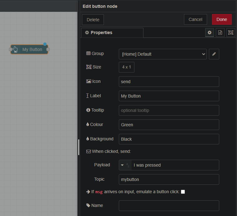
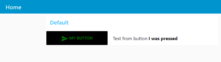
As shown in the figure, when the button is configured in this way, the text “I was pressed” will be sent. However, to view this message in the Dashboard it is necessary to insert a "passive" element, that is an element with which it is not possible to interact directly, but will only show the information received.
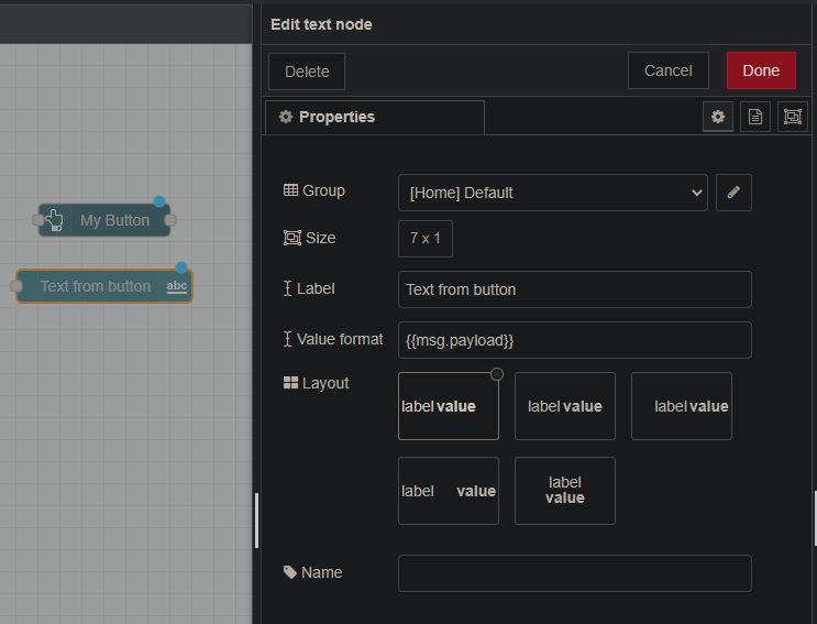
In this case, it is necessary to insert the “text” node: drag it from the Palette into the project. When it is opened, the following fields will have to be filled in:
- Group: Group to which the text is associated;
- Size: Size of the widget inside the dashboard;
- Label: Name to be associated with the text (NB this name is static within the dashboard);
- Value Format: Field to show of the message received in input;
- Layout: Arrangement of the widget (layout + value to show) within the dashboard;
- Name: Name to be given to the node within the project.
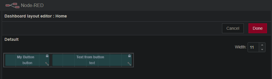
Once the nodes have been configured it is essential to organize them within the Dashboard according to the user’s needs.
Go back to the "Dashboard" section (top right), select the Tab of interest (in this case "Home") and click on the item on the right "layout". From here on, it is possible to organize the different widgets included in the project by arranging them in the order you prefer.
Once finished, click on the “Done” button.
Finally, link the button output with the text node input. In this way the message generated by pressing the button will be directed to the text node.
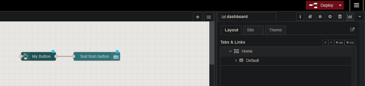
Once this connection is completed, click on Deploy and go to the Dashboard at http: // IP_SERVER: 1880 / ui .
You will be redirected to the “Home” Tab where to find the only group currently inserted (Default): this one will contain the button and the text sorted according to the layout set.
By pressing the button, a message will be sent to the text node as shown in the figure.
Adding the Gauge widget
Another widget of great interest is the Gauge: a circular indicator through which the position of the data received within a well-defined scale can be viewed. In this example a function which generates a random number (between 1 and 10) that will then be shown on the indicator, is integrated.
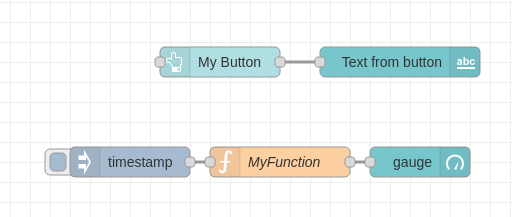
Insert in the project an "inject" node, a "function", the "gauge" node and connect them as shown in the figure.
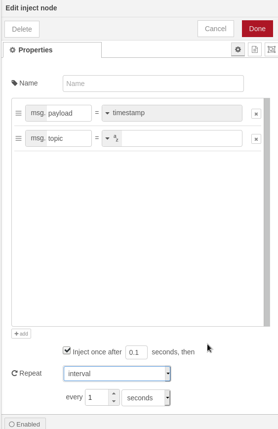
Configure the "inject" node to start the function every second as shown in Figure.
Select the item "Inject once after 0.1 seconds, then" and enable the item "Repeat" by defining "Interval - every 1 seconds".
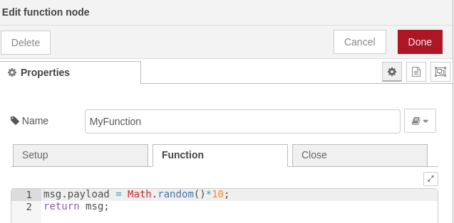
In the function node enter the following code snippet:
msg.payload = Math.random()*10;
return msg;
Every time this function is started, it will generate a number between 0 and 10 and return it to the output. In this case, the output of the function is connected to the input of the Gauge node.
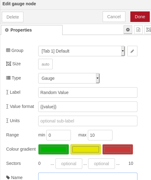
The last step is the configuration of the Node Gauge.
- Group: Group which the button is associated to (and relative Tab);
- Size: Size of the widget inside the dashboard (it is advisable not to change this parameter at this point);
- Type: Type of Gauge to be used;
- Label: Name to be associated with the widget;
- Value format: Formatting of the text to be displayed on the dashboard;
- Units: Optional unit of measurement to be displayed on the dashboard;
- Range: Range of numbers on which to apply the color scale;
- Color Gradient: Color to fill the gauge upon receiving the data based on its position in the previously defined Range;
- Sector: Instead of dividing into 3 equivalent areas, 2 values can be indicated to limit the lower and upper range in the range;
- Name: Name to be given to the node within the project.
Once the project has been deployed, go to the Dashboard.
You will be able to see your Gauge which, every time you receive a new value from the function (with an interval of one second), will adapt and color according to the parameters indicated in the relative configuration.